
Directional Pulse (Based on SPX)

Its been a while since I posted and apologies for that, but I’ve had to deal with some nasty family stuff and then catch up on my main business as a result, then for good measure throw in some holidays abroad into the mix.

I thought the best thing to do was to reset and look at the directional pulse of the market as I haven’t been living the market week to week. As you may know already I do not day trade, rather I invest in 3 and 6 month periods of time. This has always been my method after I failed miserably at day trading. If this isn’t your cup of tea, please unsubscribe, but if you want to take a rain check from time to time this is probably a nice compliment to other writers on Substack and beyond.
With that said lets look at the SPX and see what it is telling me on a short to wider time line.
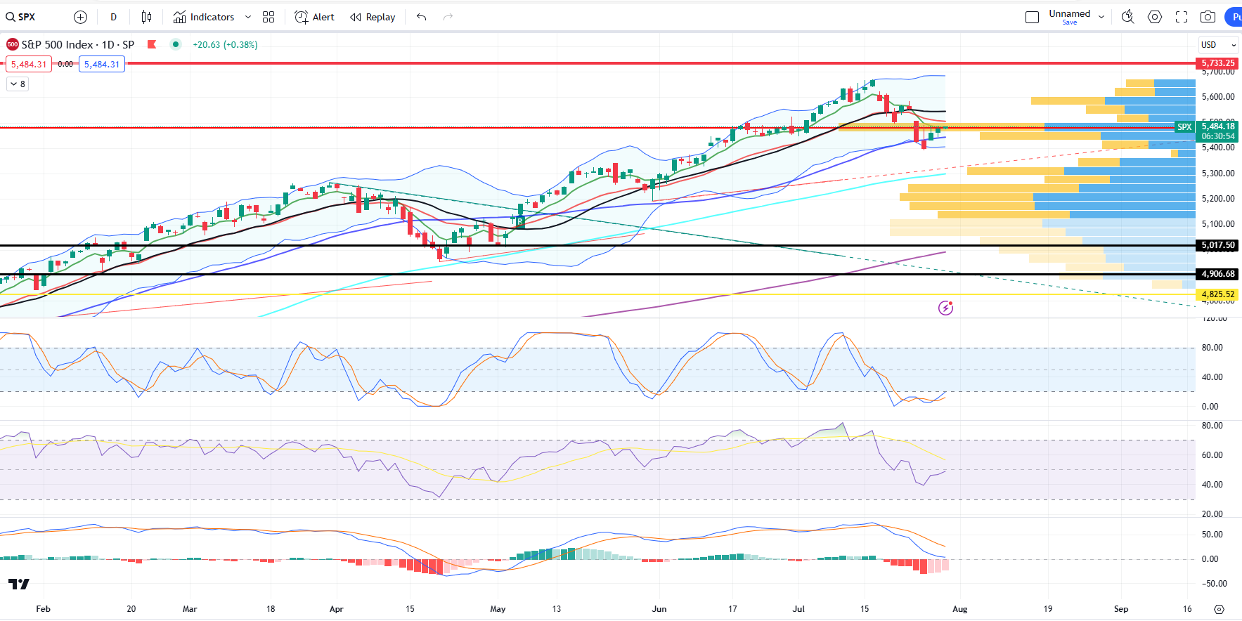
The above chart is the SPX on the daily time frame and it includes other indicators including the MACD, RSI and Stochastic RSI. Within the main body of the chart you can see the VPVR shows we are at a place of high volume or point of control.
I have measured out a target of $5733 from the previous inverted head and shoulders pattern and this level has not been hit yet. Its important to note that while we are at a critical point of volume and in the middle of earnings season, both RSI related indicators are pointing upwards while the MACD is still in a downward trend, but possibly coming to the end of that current downward trend on the daily.
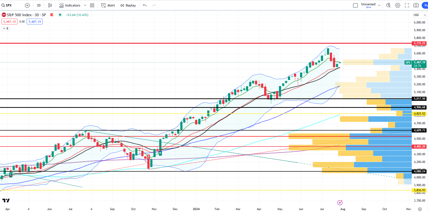
Similarly (with less clutter) the 3Day Chart for SPX indicates we are at the same point of control (high volume level) where we sit as I write ($5480 level). The Bollinger Bands do provide risk to the downside with $5200 a possible stop off point. But as on the Daily Chart there is room to the upside too and the $5700 level is possible.
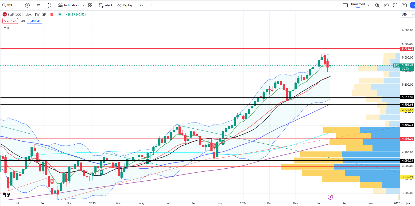
Again with less clutter we see above that the Weekly Chart represents similar risk to the downside if not a little more towards the $5000 level, but the $5700 (or near) is again the max level within the Bollinger Bands.
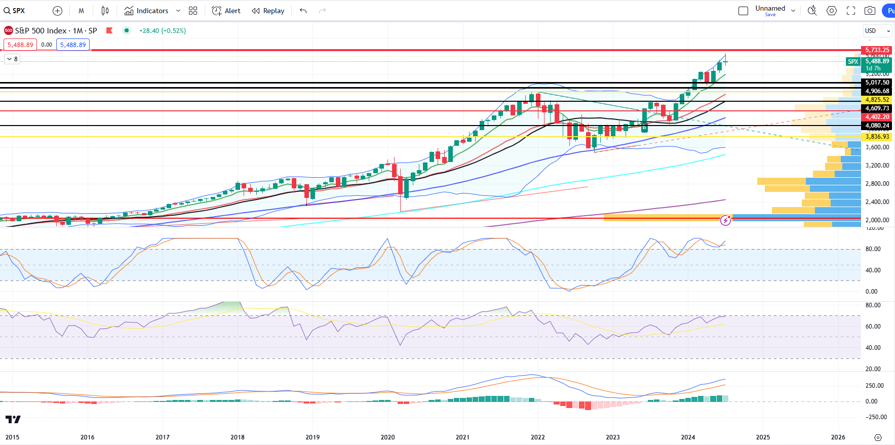
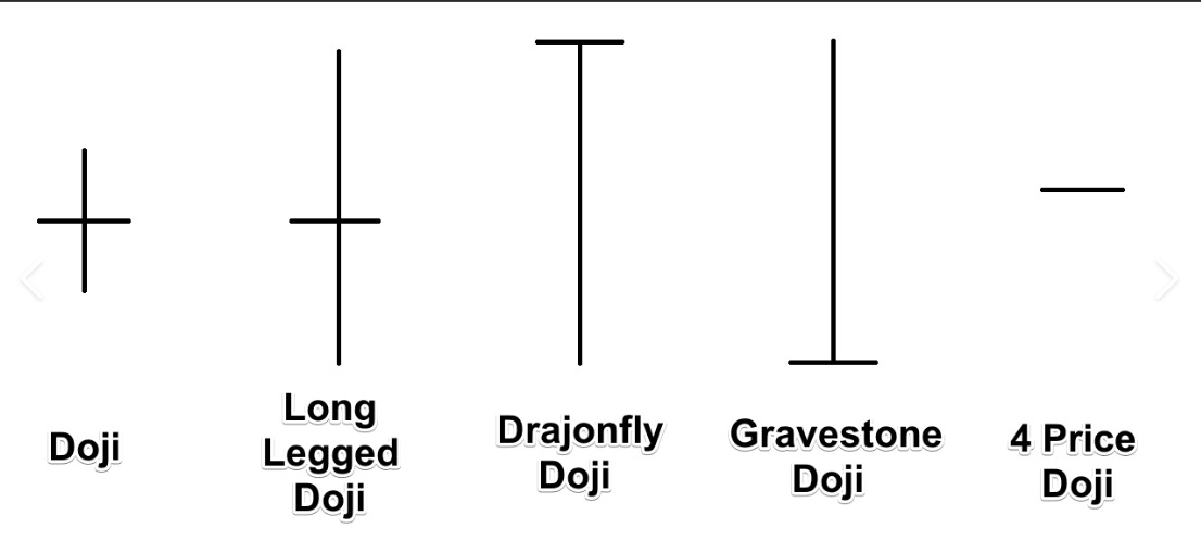
Zooming out into the Monthly Chart SPX and you can clearly see from the other indicators, MACD and RSIs that the up trend in very much in play, but there is a possible dangerous gravestone doji candle forming with the end of July looming tomorrow.
It is this monthly chart that will (for me) dictate the next move, whether this is a topping pattern or that of a nice continuation of the SPX breakout to the upside.
As I wrote in late May we are in an interesting zone and while we broke above the May level, in June and subsequently the in July, we have retraced and are back at a time of conflict. Do we continue to climb the wall of worry or do we fall down the slope of hope? The reliance on the SPX index on the Mega Cap Stocks (particularly NVDA 0.00%↑) is a concern and perhaps we do see $5000 before $5700. That being said I would be taking 50% profits at the $5700 level and buying sell offs. Unfortunately there are no guarantees in life or these markets.
NB: This is not investment advice and you need to consider your own risk and consult your own independent advisors being deploying any of your hard earned cash into these crazy markets.